Quick Tips to Drive Conversion
4 Min Read
Conversion Rate is the most important metric when measuring the business performance of a digital storefront. How often a visitor makes a purchase affects almost every part of a brand or business: each purchase made lowers the acquisition cost of every customer, adds to the overall revenue, and can be the beginning of a long-term customer relationship.
Brands that implement personalized experiences, recommendations, and offers on every page of a storefront will increase the ROI on their acquisition efforts exponentially. Corra recently surveyed almost 400 industry experts to see where they saw room for growth in 2023 and where they’re investing in 2024. Take a look at the Future of Ecommerce Technology Report here.
At Corra, we have a conversion rate optimization program where we help enlisted brands boost their conversion rate alongside other important customer-centered metrics like add-to-cart metrics, average order value, and revenue per customer.
Read on to learn which areas help optimize conversion rate and how to turn window shoppers into repeat customers.
HOMEPAGE
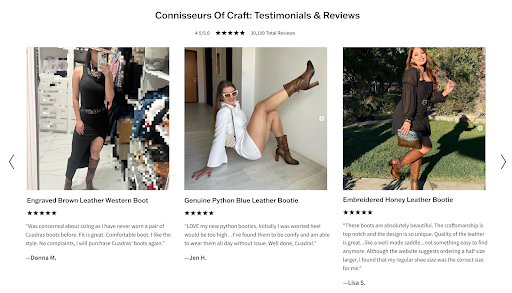

A change that increases a website’s conversion rate is to use social proof of customers enjoying the brand’s products or services on the homepage.
Social proof is content like images of customers speaking positively about a product on social media, or including customer testimonials on a brand website’s homepage.
This tactic, which is relatively painless to implement, is proven to increase user engagement and create a more invested customer who is more likely to purchase. Corra has implemented this for multiple clients, each time seeing positive results. See examples here and here.
CONVERSION RATE UPLIFT 10-30%
NAVIGATION
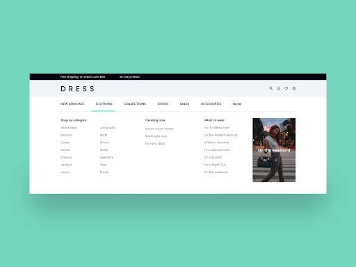

Sometimes simple changes can have big results. Changing a navigation menu’s typography and drawing contrast between a menu’s font and background colors can dramatically increase legibility and utility, spurring users to spend more time on the website discovering products.
While this change may seem small and obvious, Corra makes these decisions through heuristic audits and user analysis so brands can be sure proposed changes through our CRO program are backed with data and driven by client needs.
Making a website more enticing for customers to explore will result in more purchases and a higher conversion rate.
CONVERSION RATE UPLIFT 10%
GLOBAL MESSAGING
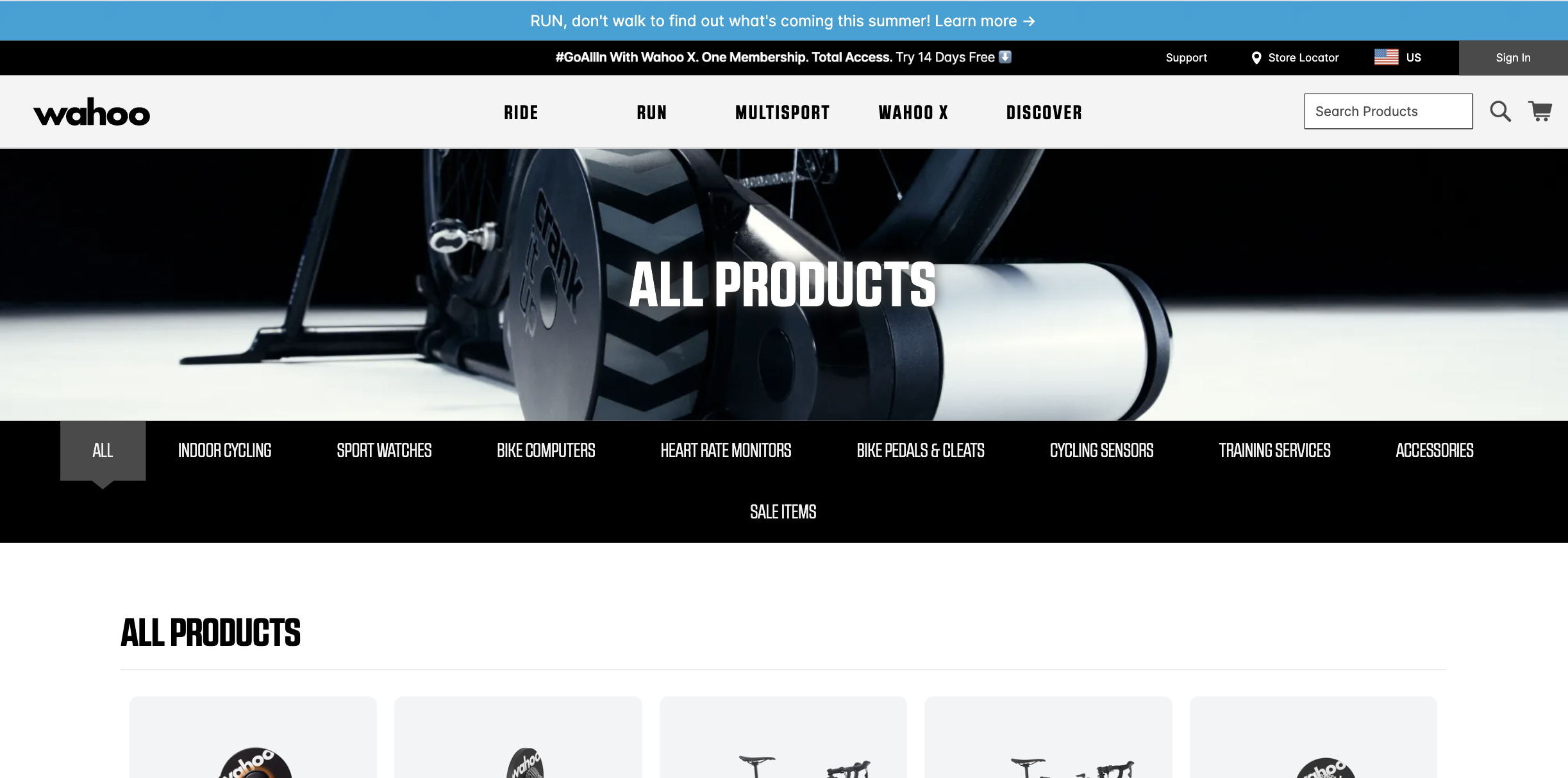

By including a CTA or promotion on the top banner of every website page, conversion rates will increase for that specific product, promotion, or subscription. It is paramount to pay close attention to which services are advertised in this location because it is at the top of every website page.
For example, Corra client Wahoo Fitness wanted to promote their subscription service as a package with their fitness computer products. By putting a CTA banner to join the subscription service at the top of every page, enrollment in the service significantly increased. This is an example of a brand internally deciding which services or products they’d like to promote and then using their various channels to drive engagement with that product or service.
CONVERSION RATE UPLIFT 10%
PDP(Product Description Page)
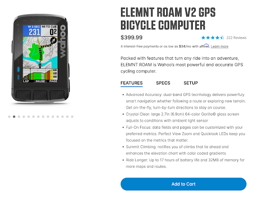

The PDP is the page that contains all the relevant info about a product, such as features or product materials.
Changing the product info on a PDP from paragraph form to bullet points yields positive results.
Through our user behavior analysis, it is clear that product descriptions in bullet points are read far more frequently than descriptions in paragraph form. This content being read more allows merchants more control over what info their customers have about respective products, and increases customer engagement and conversion rate.
By utilizing CDPs and other first-party data tools, brands can begin to understand what their customers want from products and then can use this understanding to present copy to customers highlighting the product or services accomplishing what customers want from their purchase.
CONVERSION RATE UPLIFT 20-35%
PLP(Product Listing Page)
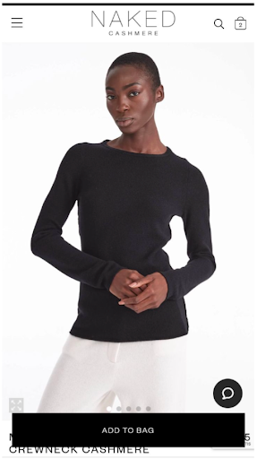

The PLP is a page where products are listed by category or filter results. A conversion-driving tactic for these pages is to add a sticky ATC button so that customers don’t have to migrate to a new page to begin their purchase journey with a product.
By decreasing the steps a customer needs to take to checkout, merchants increase the conversion rate dramatically. Having an ATC button on as many pages as possible is a surefire way to get more products in more carts, which leads to higher conversion.
The faster and easier a customer can get their product into their cart and get to the checkout screen, the more likely they are to make a purchase.
CONVERSION RATE UPLIFT 10-15%
CHECKOUT
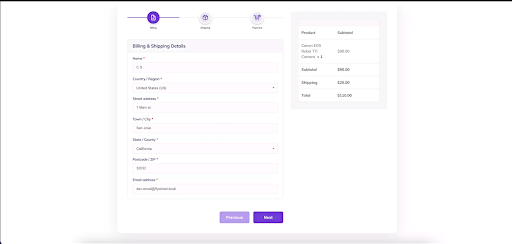

Minimizing the number of clicks needed or pages to navigate to checkout creates higher conversion. A one-page checkout is the industry standard now for good reason. Each successive page a customer has to navigate to make their purchase lowers the conversion rate by almost 10%.
In this same spirit, limiting the number of necessary form fields per checkout is a guaranteed way to increase conversion. The more information a checkout process saves, the less information a customer manually inputs during checkout, leading to higher converting experiences.
The standard checkout process should have as few form fields as possible to maximize the number of users that get to the checkout screen and make a purchase.
CONVERSION RATE UPLIFT 10% PER PAGE REMOVED
Contact us today to begin working with our analytics, SEO, and conversion specialists to help your website convert more efficiently.

