Fashion at Your Fingertips: Top 5 Mobile Solutions from Apparel Companies
4 Min Read
Mobile technology offers retailers a powerful opportunity to engage consumers 24/7–an opportunity that has been increasingly used throughout the fashion and apparel industries.
Gilt.com, who’s deep discounts and staggered sales times has nurtured a daily shopping habit for countless couture shoppers, estimates that mobile purchases could account for as much as 50 percent of their sales next year. (Kevin Ryan, Founder and CEO of Gilt, refers to mobile as a “dominant player” in the online world. ) Another online fashion retailer, Skinny Ties, has seen its units-sold metric jump 78% after installing its highly flexible responsive design site.
No doubt about it, evidence suggests that fashion retailers can substantially increase their revenue by developing mobile strategies. The only question is how. Within the apparel industry, I’ve seen it done three ways:
- A mobile website, which is optimized for smaller screens and provides a much better user experience than a desktop site on a mobile browser
- A responsive website, which is designed to automatically adjust to all browser sizes (and is less expensive than building separate desktop and mobile sites)
- A mobile app, which is specifically designed for a mobile platform (i.e. iOS, Android,etc) and is best for merchants who want to incorporate lifestyle content or encourage daily or habit-forming usage
Below, I’ve listed 5 top apparel and fashion brands whose solid mobile solutions are worth a mention:
Skinny Ties (responsive design)
www.skinnyties.com
The responsive design automatically organizes items on the page in a way that is easy to navigate on any screen. The categories are intuitively organized, allowing consumers to easily browse for new items from any page. Users can easily access promotional information, Social Media links, style guide and newsletter subscribe button from every page.


GILT (app)
www.gilt.com
Endless scrolling – New categories and products load automatically so the user does not have to load a new page. Time sensitive sales create urgency for the consumer, prompting more immediate purchases. Logging in with a Gilt account makes checking out extremely fast and pain-free.


JACK THREADS (mobile site + app)
www.jackthreads.com
When users sync account information with Facebook credentials, they don’t have to enter credit card details for purchases. Even when scrolling, the add-to-cart button shifts to the bottom of the Product Description Pages (PDP) screen. The image carousel on the PDP is a compact solution to show multi-view product images on a mobile screen.
NET-A-PORTER (app)
www.net-a-porter.com
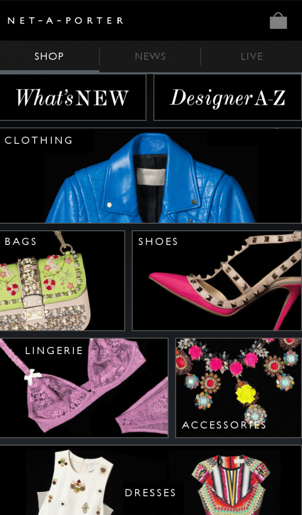
This editorial shopping app is structured like a weekly magazine. Consumers can read the editorial like a magazine, and shop products from the editorial. The product carousel rotates throughout the editorial to automatically scroll items for consumer. The visually appealing color contrasts and layout perfected for mobile technology imitates the emotionally inspired shopping experience.
HONORABLE MENTIONS:


BONOBOS (responsive design)
www.bonobos.com
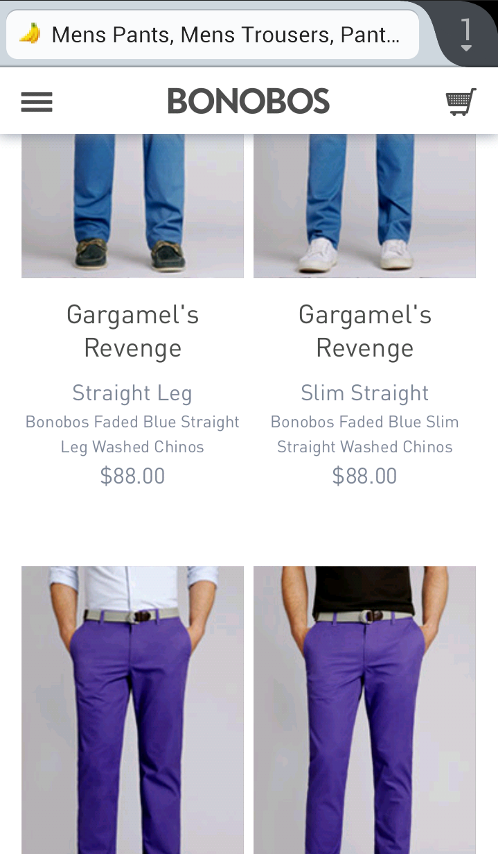
There is effortless integration of filter options on Product Listing Pages (PLP). All relevant/descriptive product information is included on PLP rather than in the PDP. The “Guide Picks” allow users to easily identify and purchase their favorite outfits found in editorial images.
LACOSTE (mobile site)
m.lacoste.com
Lifestyle content combined with the unique horizontal scrolling gives a unique mobile shopping experience.


BANANA REPUBLIC (mobile site)
m.bananarepublic.gap.com
PDP has very large images that change when a new color swatch is selected, so users don’t have to infer product appearance
Whether you are planning your mobile solutions with your ecommerce provider or internally, these companies provide great examples to follow. Any others you think we should have added to the list? Let us know!
Photo via Bridge and Beacon, email photo via Kampoll


