Designing Your Shopify Plus Experience With Corra
4 Min Read
This blog post is the shortened version of Corra’s extended Shopify Plus Guide you can read here. We interviewed Zeqing Hong, a Senior Visual Designer specializing in web and ecommerce design on the Shopify Plus platform.
﹏
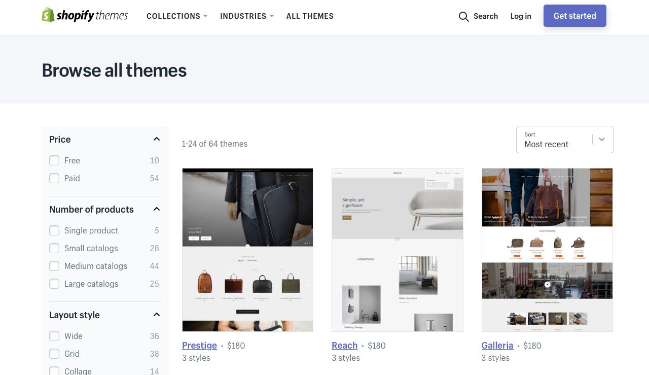
In the age of Amazon dominant commerce, your brand’s most powerful distinction will be its creative expression and the emotional response it stirs. Luckily for you, Shopify Plus themes are the perfect foundation for establishing this creative expression and weaving your brand’s story. Visual Designer, Zeqing Hong praises Shopify Plus themes for how beautifully coded and intuitive they are, calling them the Apple iOS of ecommerce templates.


“
In the age of Amazon dominant commerce, your brand’s most powerful distinction will be its creative expression and the emotional response it stirs.
JOE CICMAN, SENIOR ANALYST, FORRESTER
The decision to work from a theme is entirely up to the merchant. However, Zeqing recommends beginning the design process with a theme for various reasons. Firstly, you won’t be starting from scratch and they’ve already been rigorously tested for bugs. You can save time, budget, and scope that’s better spent customizing your theme to perfection. We also encourage clients to choose a paid theme, rather than free because they’re higher quality and facilitate a more unique experience.
There’s a lot to consider when choosing a theme. The amount of SKUs you have, if you’re trying to mirror an existing site experience, the UX flow you’re trying to achieve, new solutions you want to implement, and even SEO. As Zeqing notes, the decision isn’t purely coming from him; it’s a collaborative effort between Visual Designers, Solutions Strategists, UX Designers, SEO Strategists, and so on. The cross-disciplinary team then presents various options to the client.


Once you have defined your vision, audience, brand, and key differentiators, then it’s time to devise your visual approach. That’s where we come in. Corra can advise on the best solution to execute on your design vision. Meaning, we can do everything from theme selection to creating an experience based on data. We can even develop customized designs if your vision requires it because we have the technical expertise.
Merchants may not have the resources on hand to examine every aspect of their customer journey. It’s important to note that seemingly minor details in your CX can have a considerable impact on your conversion rate and lead to sizable revenue growth. You need designers that specialize in conversion-driven design and intuitive customer journeys to detect these.
Our designers have spent countless hours analyzing heatmaps of ecommerce sites, watching customer session recordings and navigating data analytics tools. This adds another layer of expertise (stronger hypotheses for ways to better the site) and UX thinking that not all designers possess. Oftentimes, our client’s in-house designers have a background in graphic design and print but not necessarily web and ecommerce. Corra is used to working collaboratively alongside a brand’s in-house design team to inform styling and establish overall look and feel while taking the lead on UX flow and conversion-driven design.
It’s a common misconception that Visual and UX Design function independently of each other. At Corra, they’re very much integrated. Visual designers have UX knowledge and UX Designers are attuned to the look and feel of the site. Both are focused on creating a visual narrative that may be subconscious for the user but is actually very strategically guiding them through the sale. Visual Designers like Zeqing are able to look at a static page or wireframe a UX Strategist hands them and envision how it should flow and moves on a screen. Especially when they’re involved in the entire process from the brainstorming phase right through to customizations and bi-weekly scrum meetings with clients. If you want to learn more about our project delivery process, read our blog, ‘An Inside Look at Faherty’s Agile Project Delivery.’
“
53% of mobile users will abandon a site if it takes more than three seconds to load. So if images aren’t sized correctly it can significantly hinder sales.
ZEQING HONG, SENIOR VISUAL DESIGNER
Another point to highlight is the importance of continuing to optimize. When we hand over the site to a brand’s internal team and they take over the production of assets, we often notice a decline in best practices. This is most noticeable in the use of correct image sizing which directly correlates to page speed, impacting their conversion rate considerably. For context, 53% of mobile users will abandon a site if it takes more than three seconds to load. So if images aren’t sized correctly it can significantly hinder sales.
Merchants that are interested in continued support from Corra in the form of optimization, personalization, visual enhancements, data analytics, A/B testing, and more, can inquire about our TotalCare services. We work as an extension of your team on CRO (Conversion Rate Optimization) initiatives and ways to further refine your customer experience. Additionally, if you’re interested in finding a Shopify Plus partner agency to design your site, contact Corra today. We have a dedicated Shopify Plus team to assist you.

