2018 Visual Design Trends That are Here to Stay
4 Min Read
It’s a gloomy Monday morning, and two vendors have scheduled a meeting with your team to pitch their latest products. The first vendor speaks in a flat voice, with no variation in rhythm or tone. He is also showcasing a PowerPoint full of bullet points and unnecessary stats. After one hour, he asks if there are any questions. Awkward silence.
Then, the second vendor comes in. He breaks the ice with questions, and he uses body language to emphasize important points. His slides are rich in visuals, and transitions from topic to topic are clear. Let’s be real: no matter how good his product is, he is engaging the audience, and he has more chances to continue the conversation.
Customers crave the same level of engagement, now more than ever. They’re not interested in the passive consumption of brand messaging, and tend to prefer easy-to-scan content and gamified experiences.
So, what does this mean for web design? While users become increasingly sophisticated in how they connect with brands, design is adopting movement, interactivity and non-conventional transitions to enrich user experience.
With that in mind, here are a few 2018 web design trends that, according to Corra’s visual design team, are likely to dominate in the near future.
Parallax Scrolling
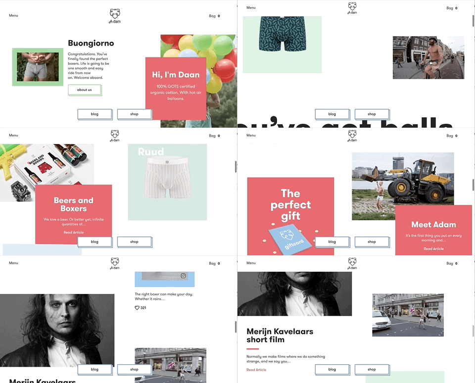
Parallax scrolling is gaining some serious traction. With this technique, background elements move slower than foreground images, generating an immersive 3D illusion. When used appropriately, parallax scrolling creates subtle movements and depth, resulting in a memorable experience.
Parallax scrolling also simplifies the way information is presented to the user. Visitors engage with a story that unfolds in the form of moving images while being in complete control of the script. On the whole, it’s a far more interactive approach to scrolling.

Micro-Mini Interactions
Micro-mini interactions are small, simple animations that will play a key role in future web design as the need for clarity or context becomes greater. Micro-mini interactions allow users to get immediate visual feedback every time they interact with them. These subtle audio/video responses incorporate personality into the whole design and add an element of fun. If your brand has a playful identity, you should consider using these key details to differentiate your site.


Layering
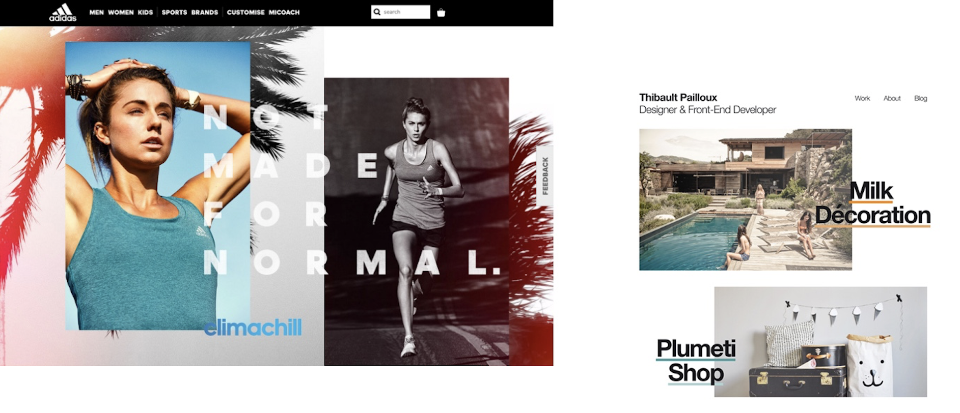
Layering is another way to add visual intrigue and an extra dimension to almost any design. In 2017, you probably noticed images overlapping bold typefaces (and vice versa). This trend is now expanding into new creative forms, from text layered on top of shapes, to multiple layers of textures and images stacked on top of each other. Layering creates a sense of depth and dimension between foreground and background elements, and it’s a smart way to break the rules of the conventional website grid.

Split Screen Layout
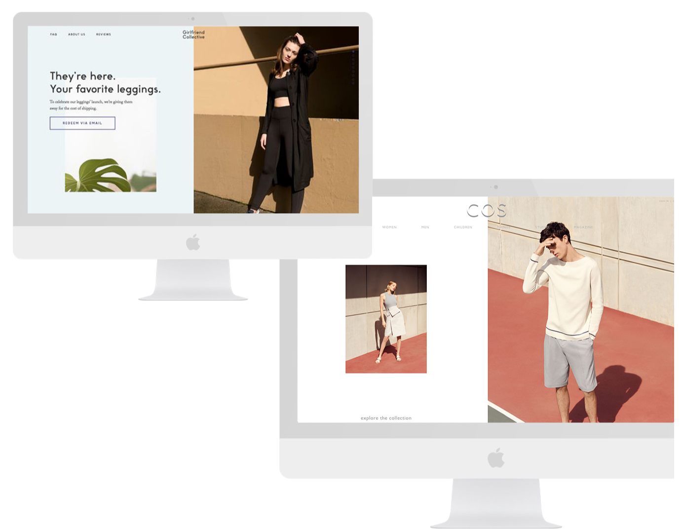
Vertical division of the screen in two equal parts, with clear visual separation, is something we should expect to see even more in 2018.
Being visually effective but not intrusive, this editorial-inspired trend breaks away from traditional horizontal banners. Split screen translates nicely onto smaller monitors/devices, as the two sections can be stacked in consecutive blocks or turned into side-panel navigation. Split screen is also an ideal background for portrait shots that wouldn’t fit well horizontally. Fashion brands will particularly benefit from the flexibility of this trend.

Gradients & Duotones
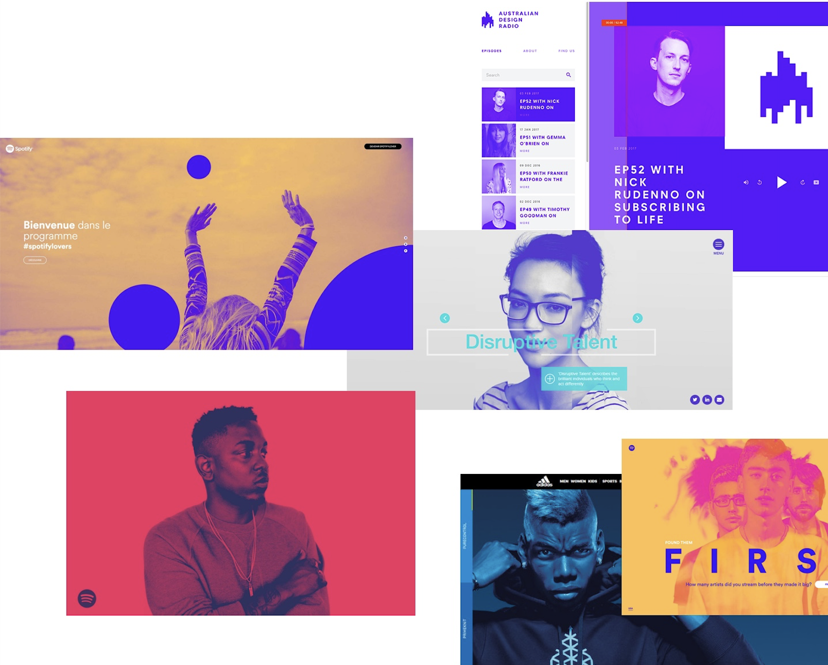
You’ve seen them everywhere, from the covers of your Spotify playlists to a multitude of logos (including the one Instagram launched in 2016).
It’s likely that the gradient and duotone trend will continue throughout 2018, as they are a great way to add an extra layer of depth and movement.

Conclusion
Should you embrace these 2018 web design trends and incorporate all of them into your ecommerce? Will parallax scrolling affect your conversion rates, or increase engagement? The answer will come from conducting periodical testing, and from an in-depth analysis of your customers’ reactions and preferences.
As with other visual trends, don’t forget to make them your own. The only downside of trending creative concepts is that they are being massively and ubiquitously used. Don’t just repeat what other retailers have done, but try to elevate the unique personality of your brand.
Interested in exploring an innovative visual strategy for your site? Reach out to our creative services team at hello@corra.com.

